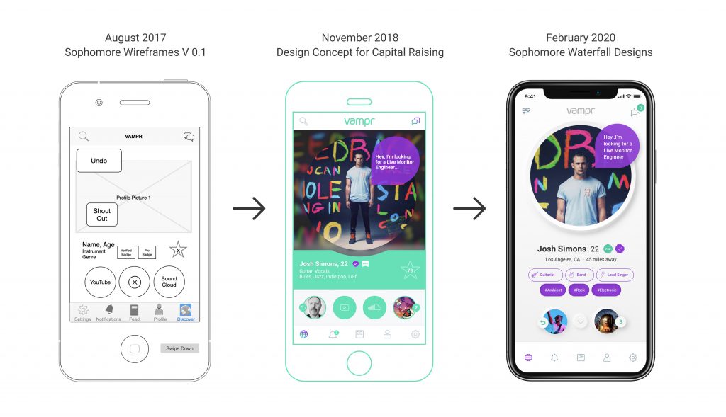
It was a balmy Los Angeles summer evening in August 2017 when the Vampr team, which typically operated remotely since well before COVID-19, concluded a rare two week in-person retreat, as first documented in this blog post. The real purpose of the retreat? To define and map out a product journey, in what would become a careful, methodical and multi-year transformation from a one-to-one meet platform – ala Tinder – to a fully fledged one-stop shop for creatives, with self-service artist tools and a social network interface which more closely resembled that of LinkedIn or Facebook.
In the time since, our plans have evolved and matured as you would expect. With four years of customer feedback under our belt we are now in a fortunate position to plan product and make design decisions based on quantitative demand.
We’ve shared these plans with you in bursts and spouts – including during last year’s crowdfunding drive, and more recently with the mysterious Waiting List feature, where select Vampr users have had the opportunity to play with a prototype of what’s coming next. Keen-eyed Vampr users have watched these plans evolve and have been patient as we’ve defied the odds to raise the funds to build out this ambitious vision.
This next step in our evolution has been referred to variously as Vampr V3 or Next Gen Vampr. However with teams pushing updates to the current apps, marketing campaigns currently underway and critical product releases being worked on in anticipation of the more comprehensive overhaul – such as last week’s milestone Vampr Publishing release – it became clear that we needed a conclusive internal codename to refer to the most important development in our company’s history.
Welcome to Blog #1 in a series of updates to be released throughout 2020 that will take you with us as we preview exciting new features and upcoming Vampr products, and journey towards the release of what we’re now calling Project Sophomore.
What is Project Sophomore?
Project Sophomore represents both the next major version of Vampr and the foundation for future versions of Vampr.
By the end of Summer 2017 Vampr had been in the market for around 15 months. We had grown from 0 users to tens of thousands of users. We now had lots of data and learnings to lean on. Our retention rate, as measured over a 12 month period, was remarkably competitive when compared with the Top 10 music apps in the App Store however it was nowhere near the levels seen in social networks like Instagram or what we’re seeing now with TikTok. From day 1 it was clear that Vampr was attracting a type of user who wasn’t shy about sharing their feedback, requesting features which in their own words would see them return and return more often. In tech these are sometimes referred to as viral hooks or loops.
Every team member had a good idea of what we needed to do. Despite an initial vision of creating a simple and effective discovery and connection tool for musicians, the Vampr userbase was demanding we offer them something which resembled a more traditional social network, with likes, comments, the ability to follow, integrate with more APIs, etc. However, with the obvious cash flow restrictions almost all startups are faced with, we needed to address several elephants in the room:
- The cost involved with such a major overhaul
- We hadn’t, at that point, defined our business model beyond a basic goal of one day offering a subscription, premium version of the product
- No one-to-one meet platform using swipe discovery had ever successfully or even attempted to transition to an open social network
The process of structuring these thoughts began with this two-week workshop where every team member put up their favorite social network, music service, or social feature from other creative platforms, onto a whiteboard. We then asked “why does this feature work”, “how might it work inside Vampr”. After getting our thoughts together and adding user feature requests from the past year we began to build a very early prototype in the form of a clickable wireframe (example below).
This scope was ambitious – we would essentially need to start from scratch from a code perspective – but we had begun to solve problems 2 and 3 from above on paper. In order to solve problem 1 we would need to raise money, and a lot of it. But we at least now had a defined vision, with concrete materials and soon-after a budget which showed a pathway to profitability.
This method of planning is sometimes referred to as Waterfall. It is often criticized for being in stark contrast to Agile development – an approach where you iterate and test new features as nimble and quickly as possible until you find a product market fit and revenue model which is scalable. Agile development is a most advisable pathway for a new startup with no user data and a pile of assumptions driving decision making. However, with mine and Baz’s combined experience of being professional musicians plus years of product feedback and feature requests, we were blessed (or burdened, depending on how you look at it) with a profoundly deep understanding of what our users wanted. This made it essential that we create a blueprint for this waterfall vision, knowing full well that over the course of development and testing new features that the vision would naturally evolve and change, all the while taking an agile approach to building out that vision. These two philosophies of waterfall and agile are not in fact incompatible, but to view them in tandem requires intense planning and an insanely focused attention to detail.
The other understanding we came to was that social networks are essentially a pile of tools bundled together, each tool carrying a significantly different value from one user to another. As we sit here in 2020 on the shoulders of giants this means, somewhat frustratingly, that you can’t really ship a social network with certain tools or features missing which people have come to expect. So how does a startup with less than 15 team members and under two million dollars in funding build out a familiar featureset to Facebook or LinkedIn, especially when our users have expressed they won’t settle for anything less? Iteratively. It’s partly why we recently asked users from our Waiting List to rate these features in priority of their perceived usefulness. It would help us in defining our sprints as we get deeper into building out Project Sophomore.
Project Sophomore is a waterfall vision. The Vampr team has defined the first Milestone 1 release which will ship this summer. This release will contain the first version of Vampr Pro, however the following steps and features will be decided by you, the user. As you will see throughout this blog series or by being a member of the Waiting List, we have a very clear menu of features, each of which have been scoped out and ready to build. Your input and feedback will help us decide which features to ship next. We have budgeted for the remainder of 2020 to deliver as much of this menu as possible, with major new features shipping every two weeks. If we get this right, we hope that Vampr Pro adoption will facilitate the continuation of this radical new approach to user-driven innovation, well into the rest of this decade.

The Journey Towards Sophomore
While some of you have noted that the app hasn’t changed all that much over the past couple of years, the transition to a bigger and better Vampr has been underway for quite some time. Social networks are only as good or robust as their backend which powers the user experience or front end. We began refactoring our backend and real-time messaging service about six months ago in anticipation of the changes to come.
From a corporate and brand perspective we have also been transitioning to the new look for quite some time, with new features on the current apps shipping, somewhat sneakily, in the design language of Project Sophomore. On social media we have been using a new language and design code for well over a year. This has been a calculated evolution so that at no point does the adjustment to Sophomore feel like such a giant leap that we end up alienating our super users. Even the Milestone 1 release this summer will feel comfortably familiar to the current version of Vampr, whilst providing us with a new foundation, written in new code, with which to build the features as seen in our waterfall prototype. Our mission statement from very early on in this process has been ‘avoid adding friction at any point’. This litmus test has been applied to product feature changes, the UX and app language expectations, right through to brand adjustments.
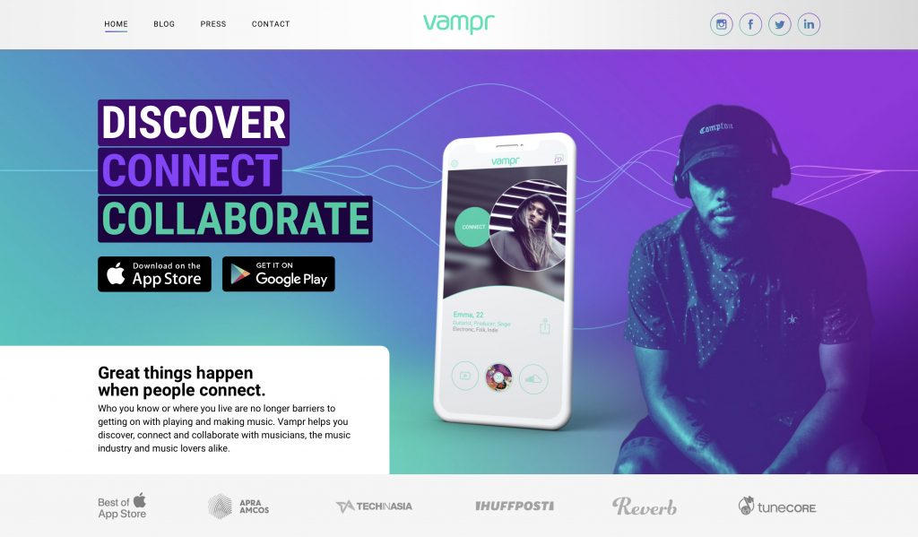
In fact, just last week, alongside the Vampr Publishing release, we simultaneously launched a brand new website with zero fanfare. This significant update to the Vampr website (see below), much like the forthcoming Milestone 1 release of Sophomore, on the surface may appear as though we’ve simply given our old product a new coat of paint.
This couldn’t be further from the truth.
With every new Vampr product we’ve shipped or plan to ship in this next phase, we’ve gone back to the drawing board, re-written everything from scratch, kept the features that people love, whilst laying the groundwork for new assets and features to be inserted seamlessly and regularly. Features which will bring the user exponentially more value, without requiring an ugly kind of feature shoehorning which most people typically resent and can spot a mile away in the social networks that they use and love.
For those of you on the Waiting List who have now had the chance to play with the new version of Vampr, we’ve also omitted a couple of exciting new changes, because there’s no fun in giving everything away all at once!

Why Sophomore?
It is often said in music that an artist’s first studio album is the product of a lifetime of experience and inspiration. So when it comes to making your second major studio album, or sophomore album, especially if the first album was a success, there is a perceived pressure to reinvent and make the followup as profound as the first record, but now with only 2-3 years of inspiration and new experiences from which to draw. No pressure!
This next version of Vampr is kind of like our second album. Project Sophomore needs to be our Nevermind, our Late Registration, our Rush of Blood to the Head. We are confident we will deliver on this front. After all, it was your feedback and passion which informed every decision along the way. We hope you will agree!
—
If you would like to sign up to the Waiting List to demo Project Sophomore in full, please do so in-app, joining #16,049 other people (and counting) whose collective feedback will help shape the future of Vampr 😎
In the next update in this series we will preview the specific features from Milestone 1 of Project Sophomore. Milestone 1 is the first Summer release of this year-long journey towards the future of Vampr. Stay tuned ✌️
Josh


