This post is a collaboration with: PosterMyWall – a free album cover maker
Create a professional album cover in 6 simple steps
Releasing an album is a strenuous, but fun, process!
You’ve created the music, considered music publishing and prepared for release – but you’re still getting started! Finally it’s time to bring all that hard work to fruition and make sure your music reaches the world!
Before you jumping into free music distribution to Spotify and other digital stores, you must create an enticing album cover.
This should not only represent your music, but also appeal to your audience.
Here are some great tips on how to make the perfect album cover for your music.
1. Consider your audience
Whether you’re a Pop artist or Hip Hop rapper, there are different expectations from fans.
When thinking about how to create an album cover, start with some research. Assessing work by your favourite artists is a great first step.
A great piece of album art can help tell an overall story conveyed by an artist.
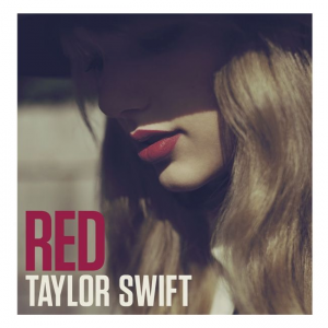
An album cover Hip Hop artists would use (like Drake’s album cover for Nothing Was The Same) would take a different approach to creating an album cover if you were Taylor Swift.
Going beyond “generic” and telling a story (whilst appealing to your target audience) is the way to make your album cover part of your art.
In the examples below, both artworks depict a profile view of each artist. The differences between each are subtle but are the key details that speak to their audience.


In Drake’s album cover we see the shaving in his haircut, his gold chain and the graffiti font, which are indications to a Hip Hop/RnB audience.
The painted portrait and the blue sky, tell a bit of the album’s story.
In Taylor’s album cover, we see:
- Red lipstick
- Styled wavy hair
- A hat
- A particular font and almost-pastel font colors.
These subtleties speak to a different audience to the Drake album.
The shadow over her face, what she might be looking at and the why? of the art start to tell a story of the album.
2. Select the right colors to represent your music
Bands or musicians typically have a special color palette. Their fans automatically associate these colors with them and their music.
When designing your own album cover, it’s important for you to go for colors that represent both your music and your personality as a musician.
When selecting the perfect color palette for your album cover, ask yourself the following questions:
- How do you want your listeners to feel when they listen to the album?
- What overall vibe do you want the album to portray?
- What colors do people normally associate with you or the genre of music you create?
Once you have the answers to these questions, you’ll be able to create a mood board of colors and create the perfect combination to add to your album cover.
For instance, if you want people to dance and feel happy, use warmer, brighter colors together. If the album is melancholic, use blue or some variation of cooler colors, or go with a single, dark-colored tone.

3. Add in some on-brand visuals
The images you add to your album cover will be the most central aspect that people take note of.
To create an album cover that catches people’s attention, you need to place specific focus on the sort of imagery you will be adding to it.
Ideally, the visuals on your album cover should be representative of you as a musician and the kind of music you’re creating for your fans. They should also encompass the image you want to portray to your listeners.
Some artists like to go the old school route and add in their own picture as the primary visual on an album cover. This is especially the case if this is your debut album. Others like to add in a visual that best portrays the sort of music they create.
If your music is more melancholic with a slow beat, go for some minimalistic imagery with a blend of colors. If your music is upbeat and chaotic, go for a maximalist image or a collage that showcases everything you want your listener to feel.

Streaming platforms and stores can be strict about what they display. There are some things to avoid in your album cover design. Avoid:
- Email addresses, websites or social handles
- Pricing
- Cut-off text or images. Or, images that are cropped into a corner with white space
- Any logos besides your artist, label or publisher
- Anything that breaks copyright law
- Blurry imagery
- Explicit content/parental advisory signs
Nudity, violence or illegal activity will also be contested. So, if you want to depict these in a creative way you will have to be really careful and potentially work with your distributor to get this right.
4. Choose a fun font for your album name
Your album name, like everything else, should be presented in a way that best represents what it’s about.
This will be much easier to figure out once you’ve planned out your aesthetic by following the first three tips.
If you’ve made a hip hop album, a loud font would be a good fit. On the other hand, if you’ve made an indie album, a simple sans serif font would do a good job if you want to depict a more sombre vibe. For some softer, feel-good music, try out a nice cursive font.
5. Consider your design on multiple platforms
Once you’re done designing your album cover, the next step is to get it ready to be marketed. This means releasing your album on multiple other platforms, both online and offline.
Your cover will have to be high resolution and look good as a small box in the corner of a screen. At the same time, your cover also needs to work on large vinyl records, CDs, and billboards.
So, before you finalise your album cover, adjust your design style accordingly.
Keep in mind different places your album will be visible and ensure it still stands out. Adjust your design according to different sizes and see if everything is still visible and aesthetically sound.
You can also resize your album cover into social media posts to amp up your online presence and get your followers excited.
6. What is the size of an album cover?
The dimensions for album covers are:
Digital
For digital releases, such as to Spotify or Apple Music, your artwork needs to be at least 1600×1600 pixels. Although, 3000×3000 is recommended.
CD
When it comes to making artwork for print, you must consider the dpi (dots per inch). A higher dpi produces a higher quality image when printed. Therefore, you should work with at least 300dpi.
A CD cover dimension is 4.72×4.72 inches. This in pixels at 300dpi is 1416×1416.
Vinyl
As with CD, vinyl covers must be printed.
At 300dpi, a 12 inch album cover would need to be 3600×3600 pixels.
Final thoughts
Your music deserves to be heard, which is why it’s so important to get the album cover right.
The key takeaway here is to focus on individual elements and make sure each one is perfect.
Online design tools like PosterMyWall’s album cover maker include a lot of fabulous album cover templates. These will help inspire you to get started on your own.
Throughout the designing process, remember to stay true to yourself as an artist. Show people what your brand is like and what your music represents.


